Overview
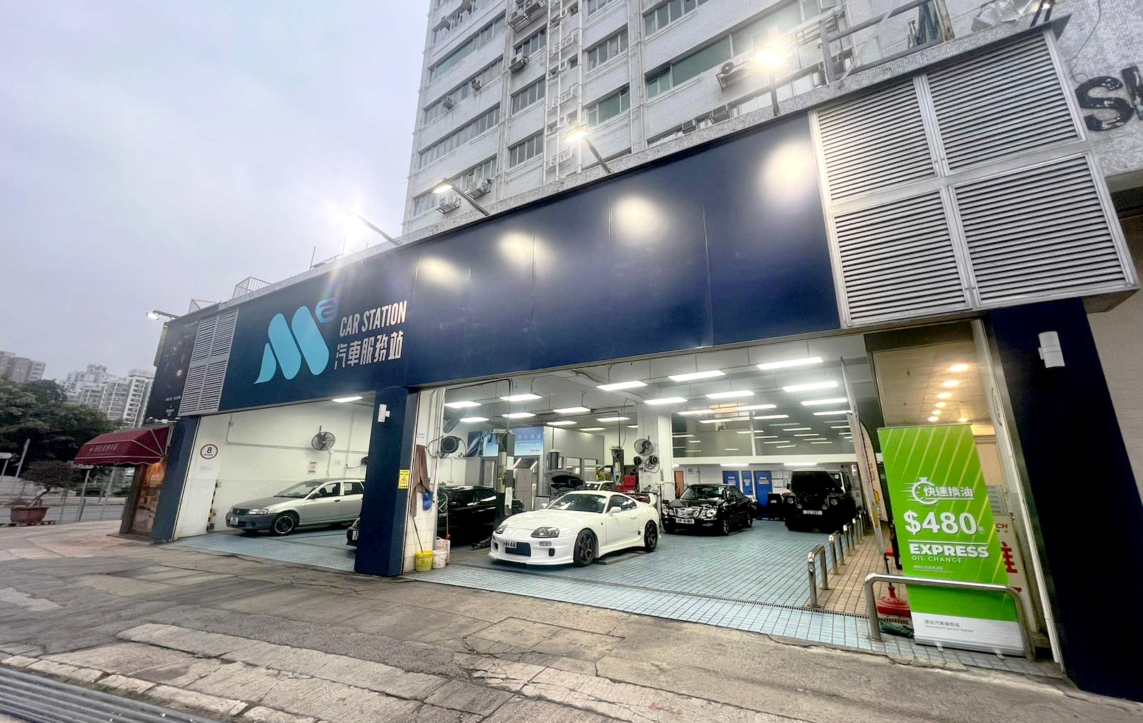
M2 Car Station is a new service station under Dah Chong Hong Holdings Limited
The target audience's age group is 20 to 50 years old and aims to appeal to individuals of all genders.
They are characterized by a dynamic, youthful, and savvy approach to clients.
M2 Car Station is a new service station under Dah Chong Hong Holdings Limited
The target audience's age group is 20 to 50 years old and aims to appeal to individuals of all genders.
They are characterized by a dynamic, youthful, and savvy approach to clients.
Concept
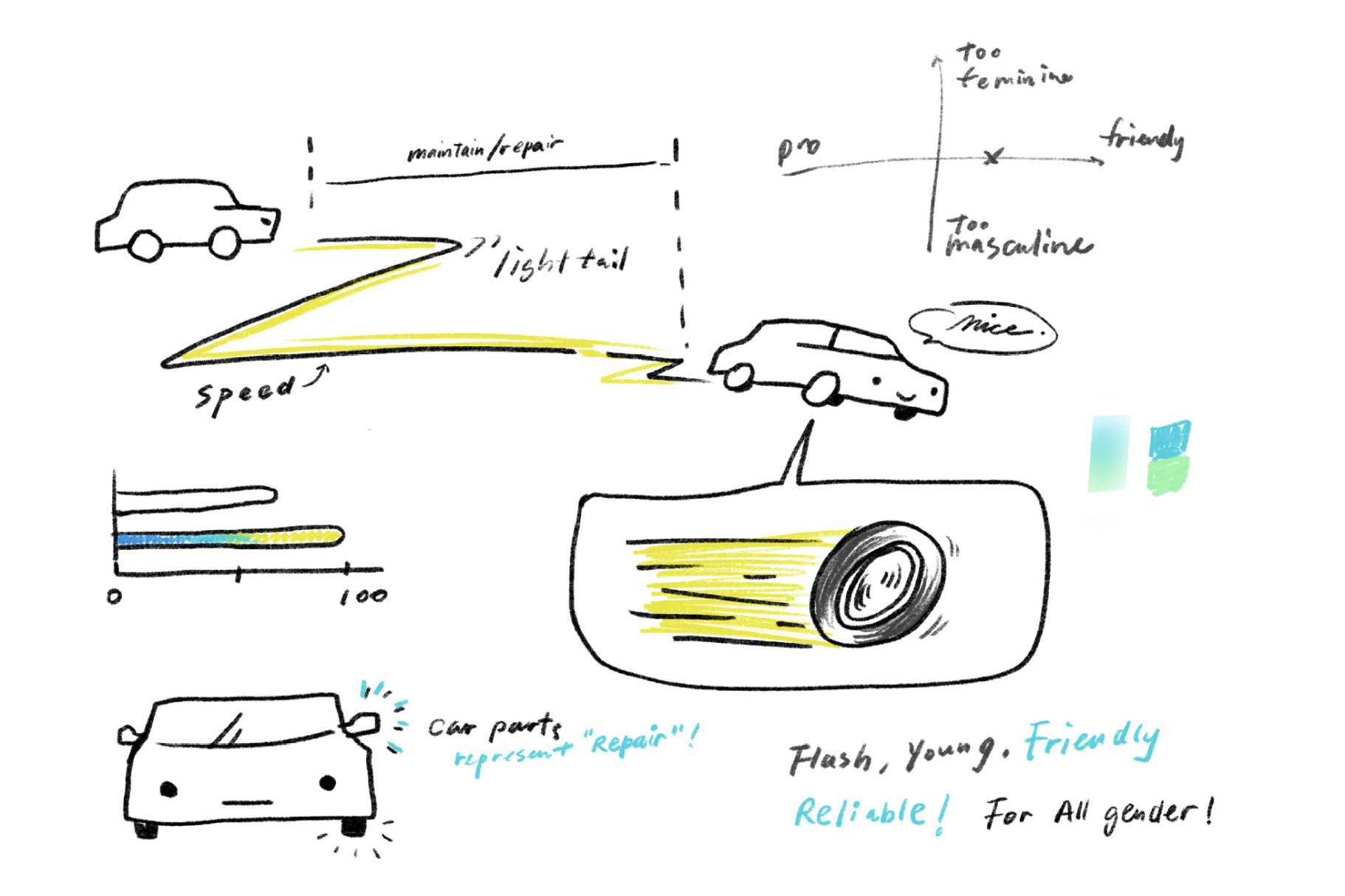
The brand philosophy centres around starting from the car, intending to provide services that are as fast as lightning and precise. The brand logo features the silhouette of a car's taillight combined with components of the car's body part - the rearview mirror as a symbol. It is complemented by a font design for the name in Chinese and English, forming a trademark. In terms of colours, a gradient is utilized, with a primary colour palette consisting of light pastel tones, while the secondary colour palette features brighter and more vibrant colours.
The brand philosophy centres around starting from the car, intending to provide services that are as fast as lightning and precise. The brand logo features the silhouette of a car's taillight combined with components of the car's body part - the rearview mirror as a symbol. It is complemented by a font design for the name in Chinese and English, forming a trademark. In terms of colours, a gradient is utilized, with a primary colour palette consisting of light pastel tones, while the secondary colour palette features brighter and more vibrant colours.
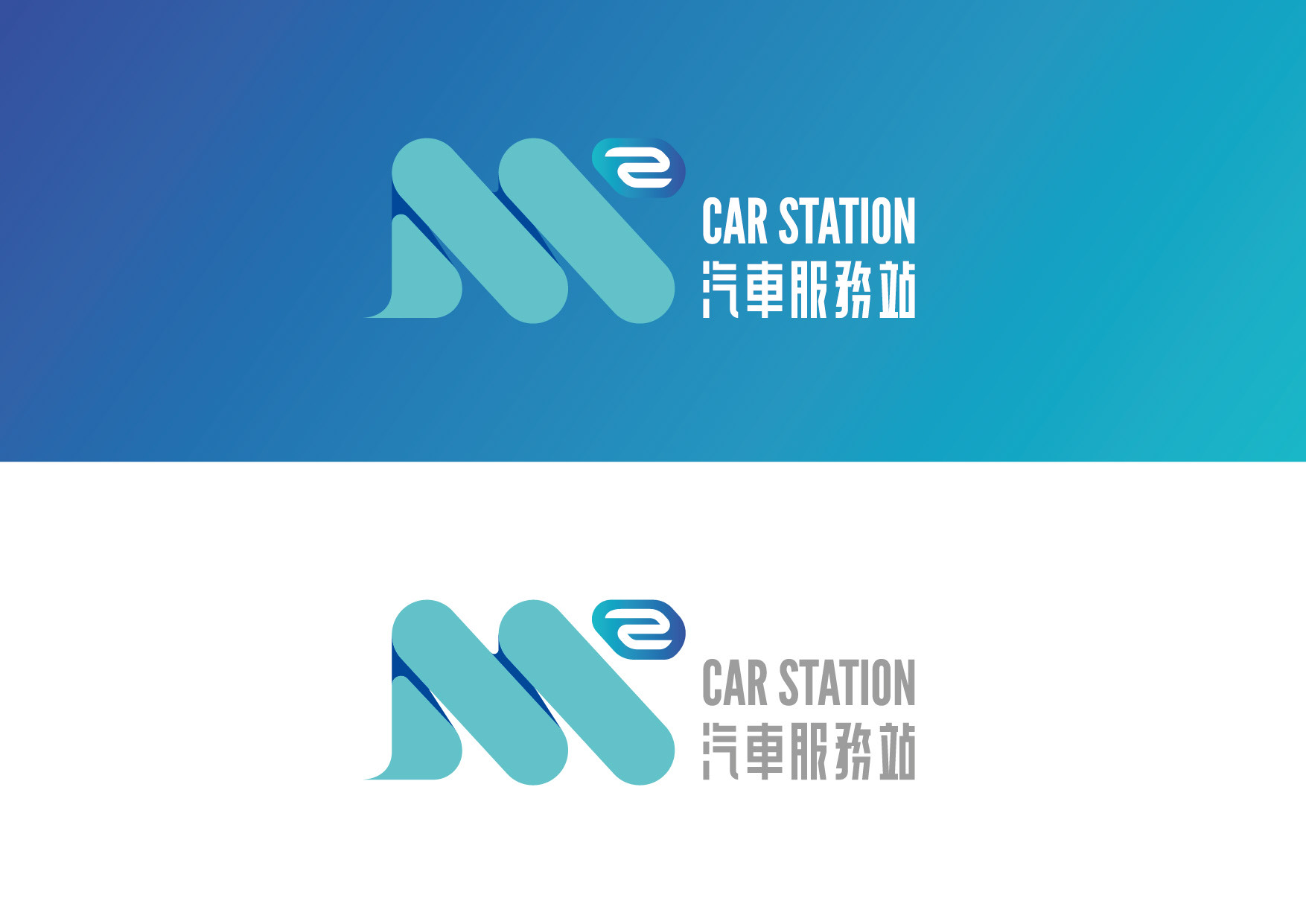
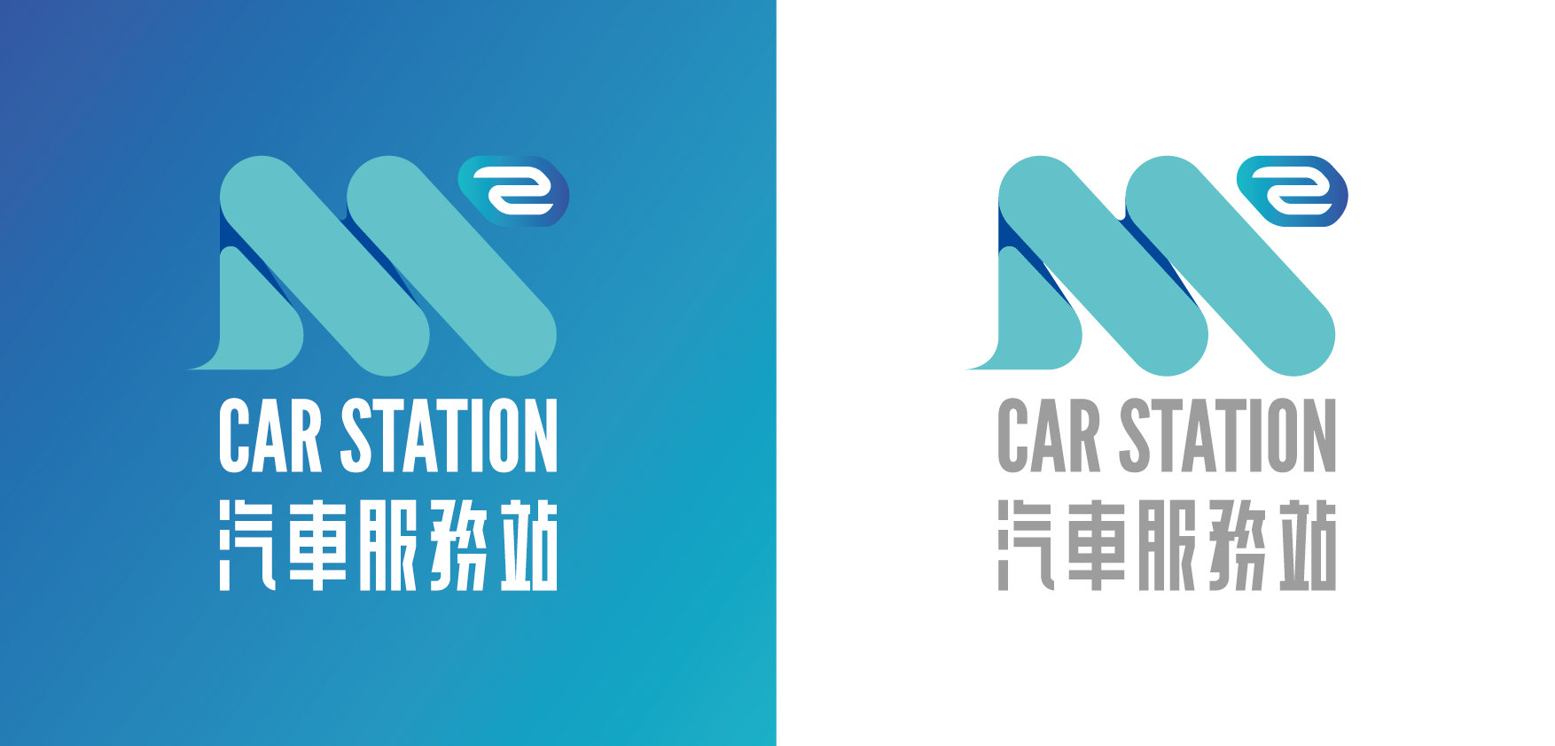
About the logo
The logo incorporates the following elements:
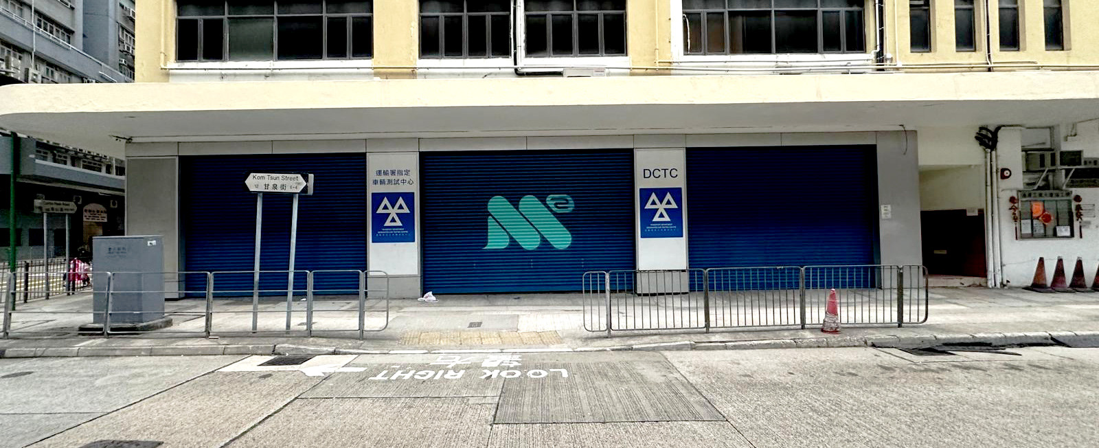
The main icon consists of the letter "M" drawn with wheels, with the numeral "2" from a rearview mirror, representing the company's business.
Tail lights draw a trail of light at high speed, symbolizing service speed as fast as lightning.
The trademark name is displayed using a youthful yet reliable sans-serif font.
The logo incorporates the following elements:
The main icon consists of the letter "M" drawn with wheels, with the numeral "2" from a rearview mirror, representing the company's business.
Tail lights draw a trail of light at high speed, symbolizing service speed as fast as lightning.
The trademark name is displayed using a youthful yet reliable sans-serif font.
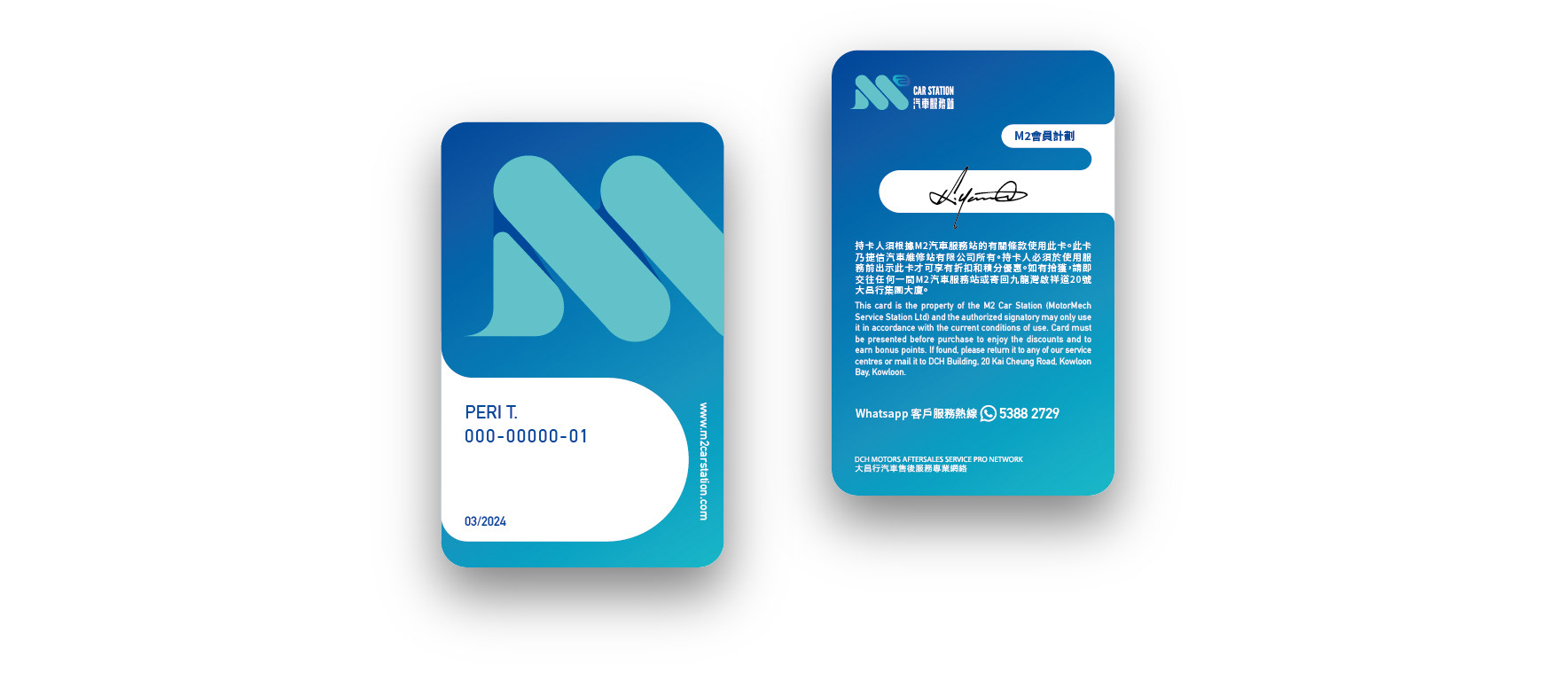
Member card
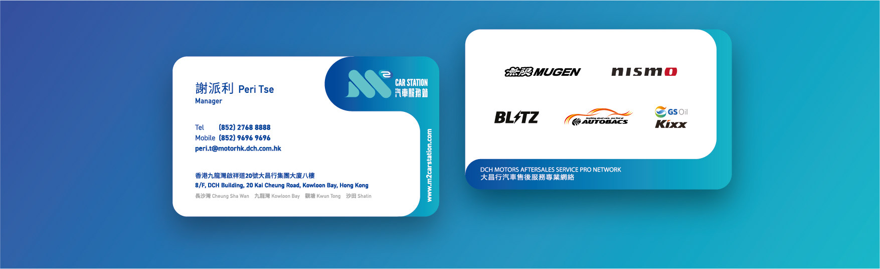
Staff name card
Client : Dah Chong Hong Holdings Limited
Logo design : Perry T.
Photography : Rachel N.
Logo design : Perry T.
Photography : Rachel N.
--------------------
Check out my latest workz :
Instagram